Torontico International
Branding + Editorial + Web
Problem: Create a logo and established and identity for a Nestlé Products Dealer.
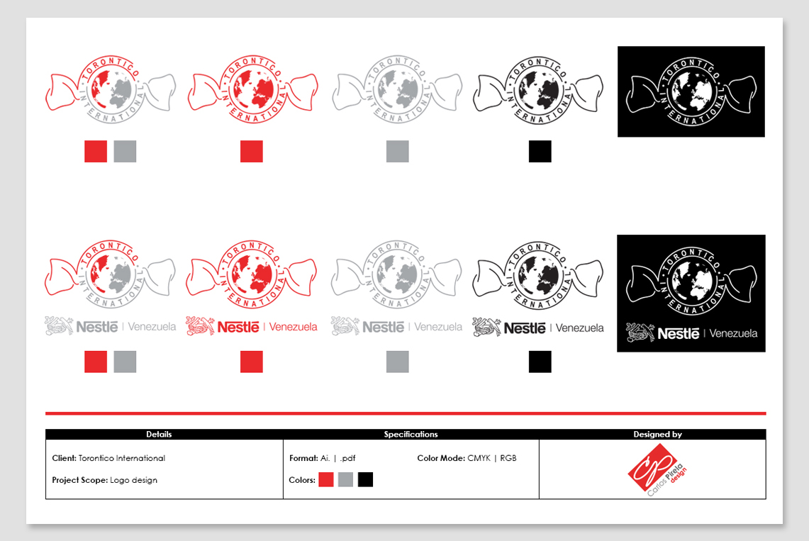
Process: The process begins with an important question to my client: “why did you pick this name for the company?” The answer was simple “the principal product that I’m going to be dealing with is “Toronto.” Toronto is a hazelnut cover with chocolate from Nestlé Venezuela. Even though that the company is going to be exporting different kinds of products from Nestle Venezuela, the client wants the logo to have the appearance of the Toronto chocolate. For this reason, I did an exploratory research on this product in order to see the package, the colors, basically how the product looks.
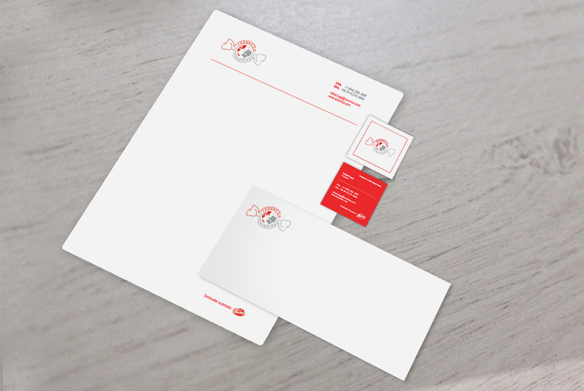
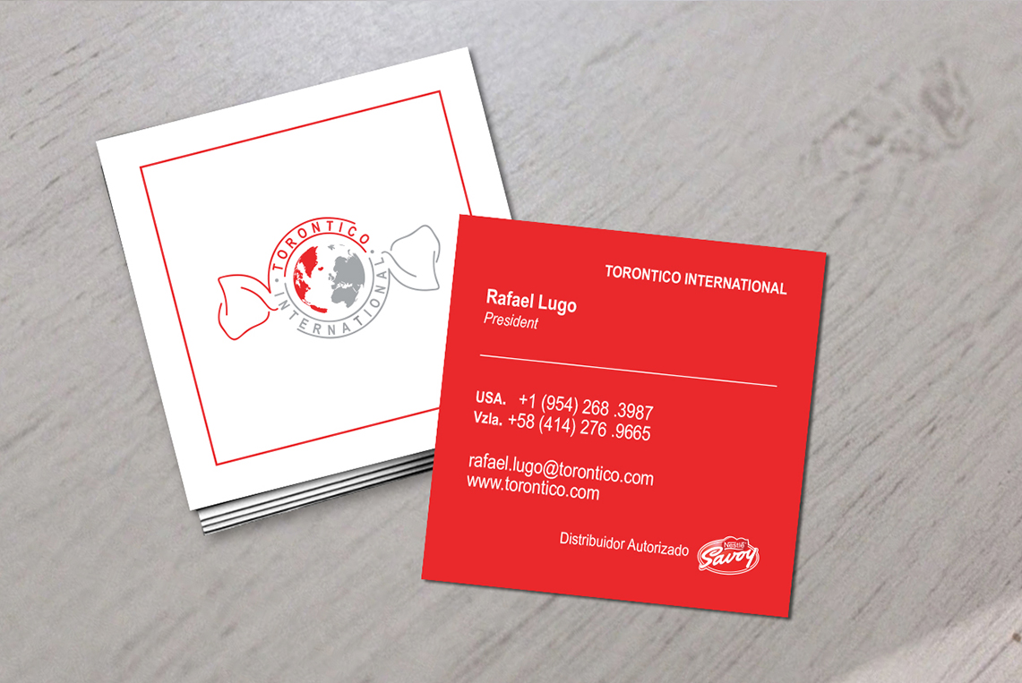
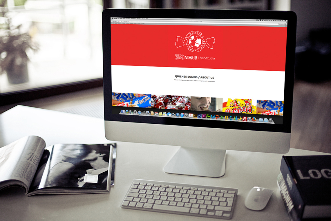
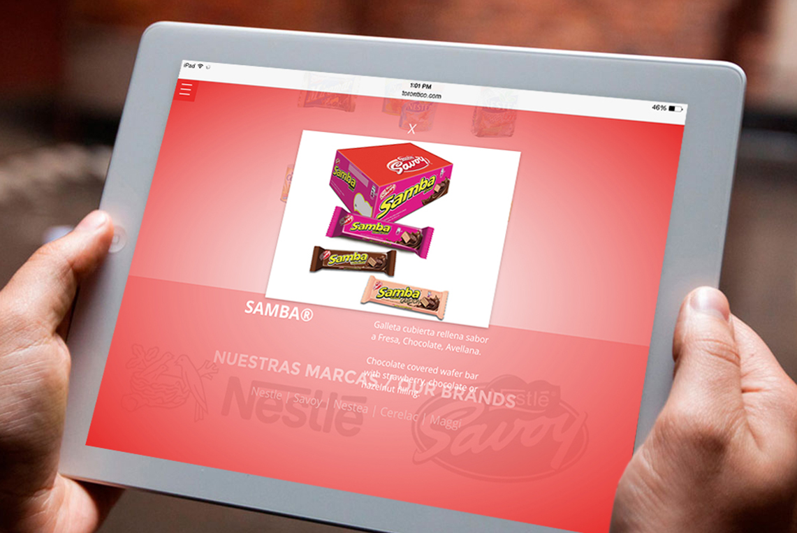
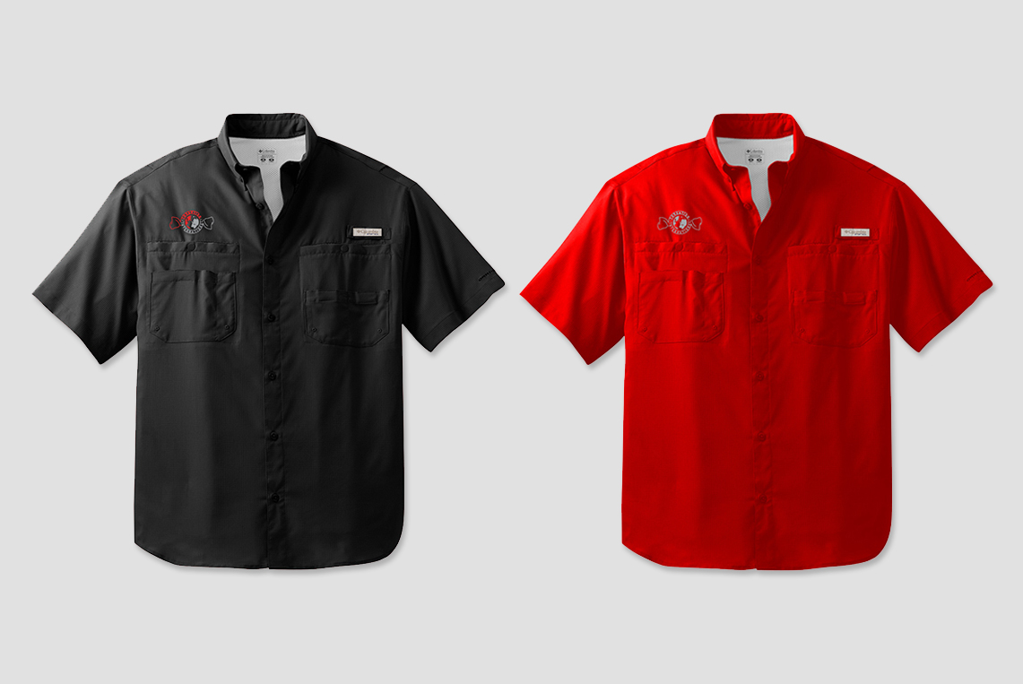
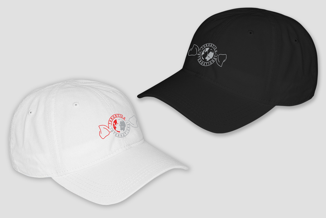
Solution: Based on my research and using the most important elements of this product “Toronto,” I determined the concept design for this new logo. The logo has the form of the original product package and colors, with the inclusion of a world map, in order to make a reference to the word “International”, which is part of the name of the company. After the execution of the logo, and in order to start a brand identity for this company, I established a color palette based on the original colors of the Toronto chocolate such as red and silver. Finally, the design of the principal representational identity elements of the company such as website, digital and print products catalog, stationary system, shirts and caps for the workers was design.
> Click here to see Torontico International Website.
> Click here to see Torontico International Products Catalog.
