The Color Id
Advertising + Branding + Illustration + Web
Problem: Create a logo and established an identity for a retail ecommerce shop. As well as, promote the products that the shop offers.
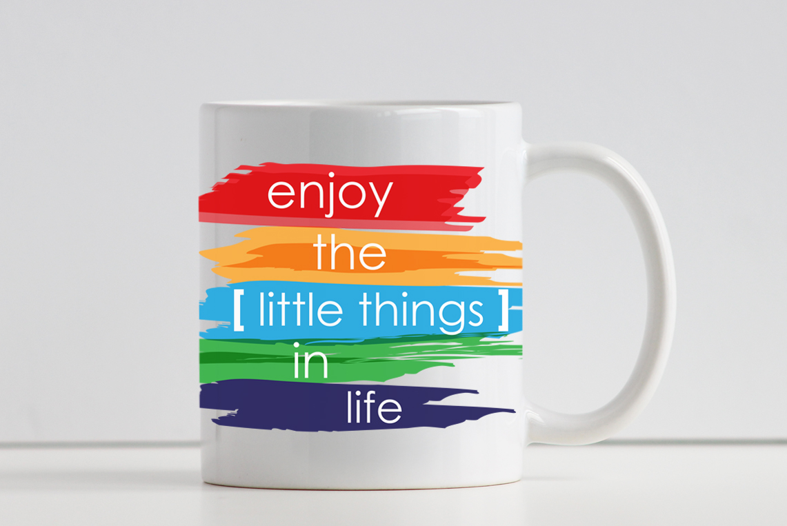
Process: The process begins with an exploratory research of the brand and the products that they are offering. The Color Id is a new company who has an interesting project and proposal for the entire world. The company basically promotes equality among humans, animals and any live being. The equality promotion is supposed to be between retail products, such as t-shirts, mugs, phone cases and print posters among others. These products are supposed to generate sales and from the sales donate part of the money to a humanitarian cause, as a way of help.
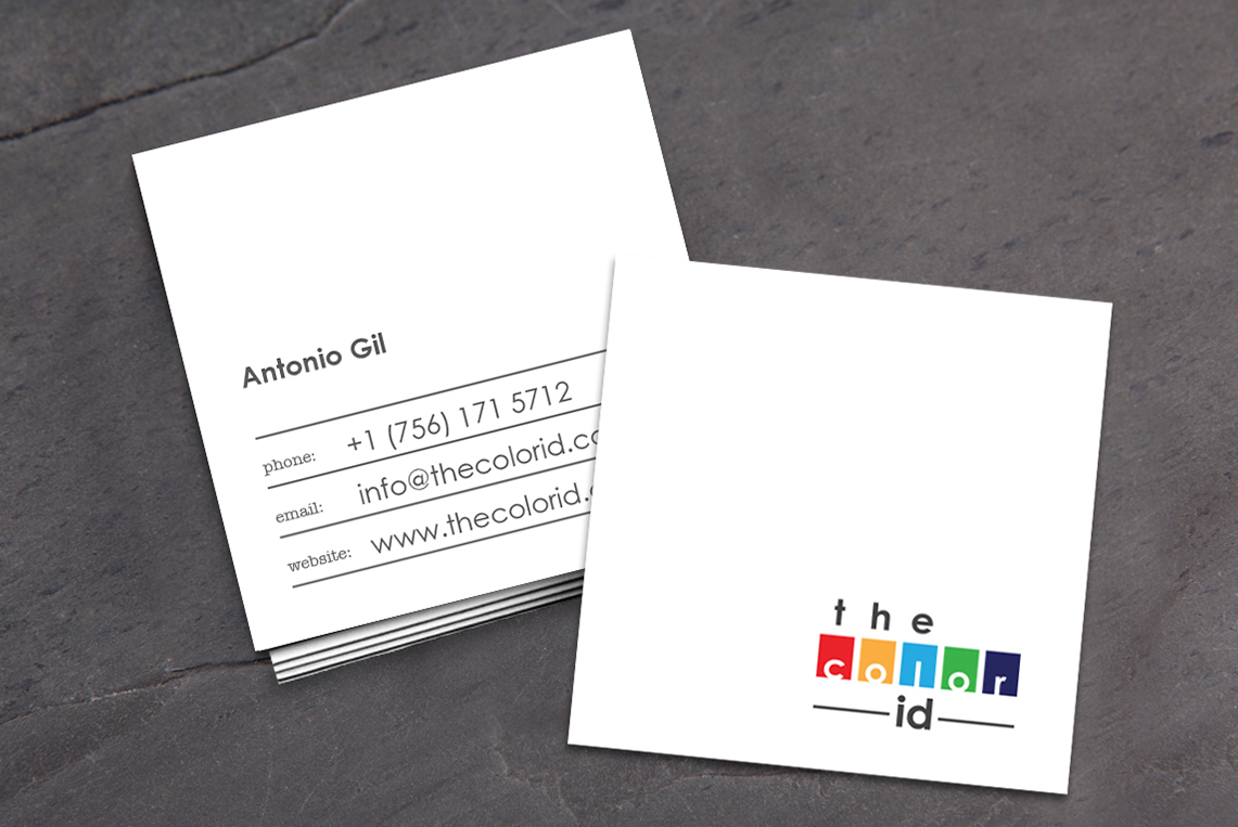
Solution: Based on the company proposal and principal core values, I determined the concept design for the logo. The logo and color palette for this company was design taking in consideration some of the principal colors of the rainbow. The meaning behind my proposal for this logo was to demonstrate to the entire world how different colors, and all of them shown in an equal way, show a beautiful thing, even after a storm. In the same way, as mentioned before the primary color palette was built from some of the principal colors of the rainbow, such as red, orange, blue, green and indigo. For the second color palette I chose gray. Gray shows an equal meaning, as well as, gives an elegant and minimalism meaning to the logo and identity to the brand. Also, as a complement for this new brand and identity, I established a font family. All these elements are going to be used on each print and digital representational elements of the company in order to create a consistent brand identity.
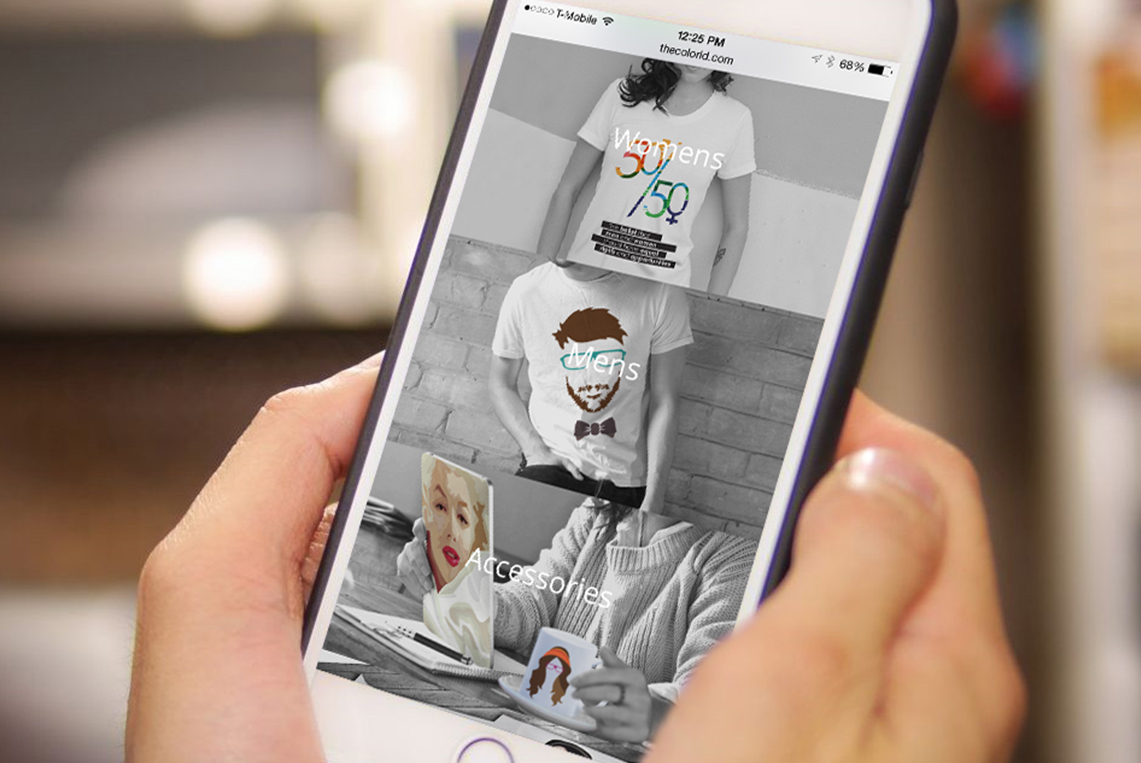
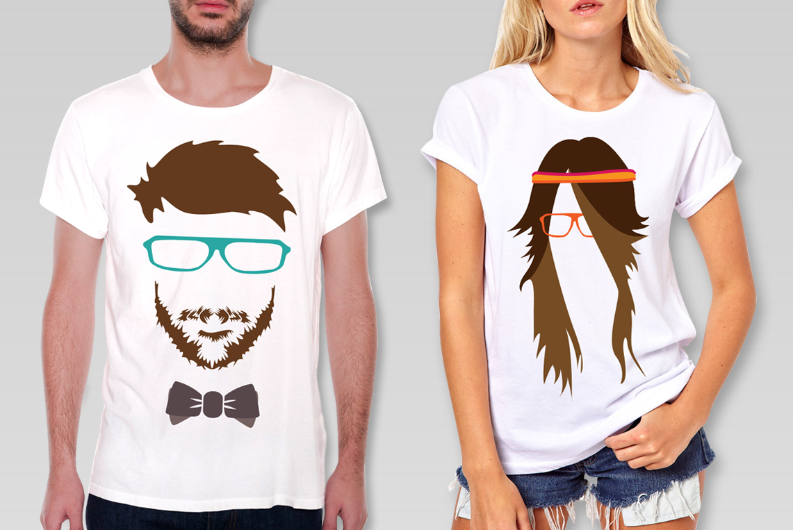
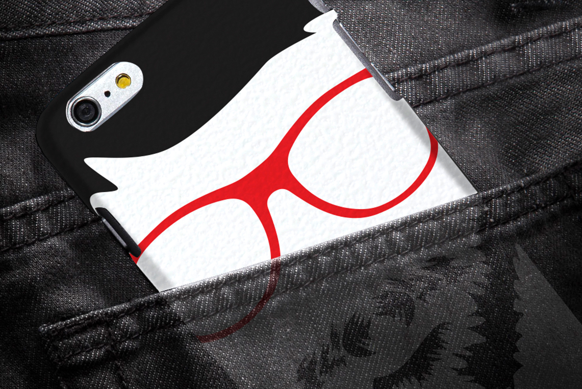
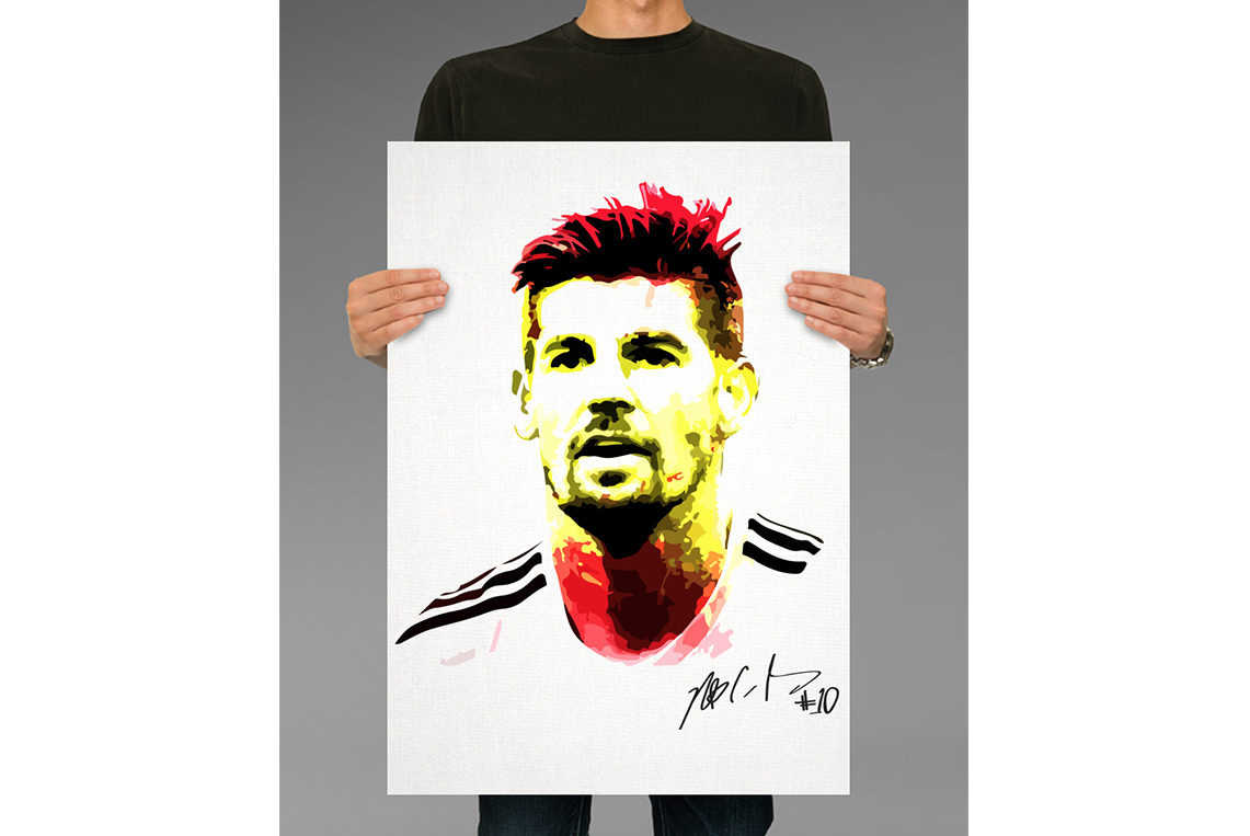
After establishing and determining the principal identity elements for the brand, I begin with the designs for the listing and promotional ads for the products and company. The proposal, for these ads was, show the models in black and white, but the product in color. The models on the products shown an equal characteristic, all of them are in black and white, and the only difference among them is the product because it is in color. By this way, the ads show the companies principal core value, and also make the product that they offer more eye catching.
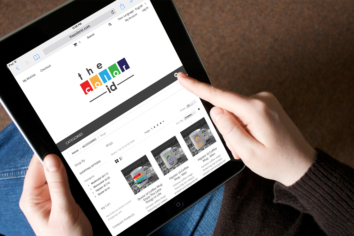
Finally, the design of the principal informational elements of the company such as, the ecommerce website and the stationary system was design. The ecommerce, was design based on a responsive template, in order to make the website easy to navigate through any device, such as computers, tablets and phones.