Liang's Bistro
Advertising + Branding + Environmental + Web
Problem: Create a new menu and new representational identity pieces for the restaurant, in order to expand the restaurant appearance and brand.
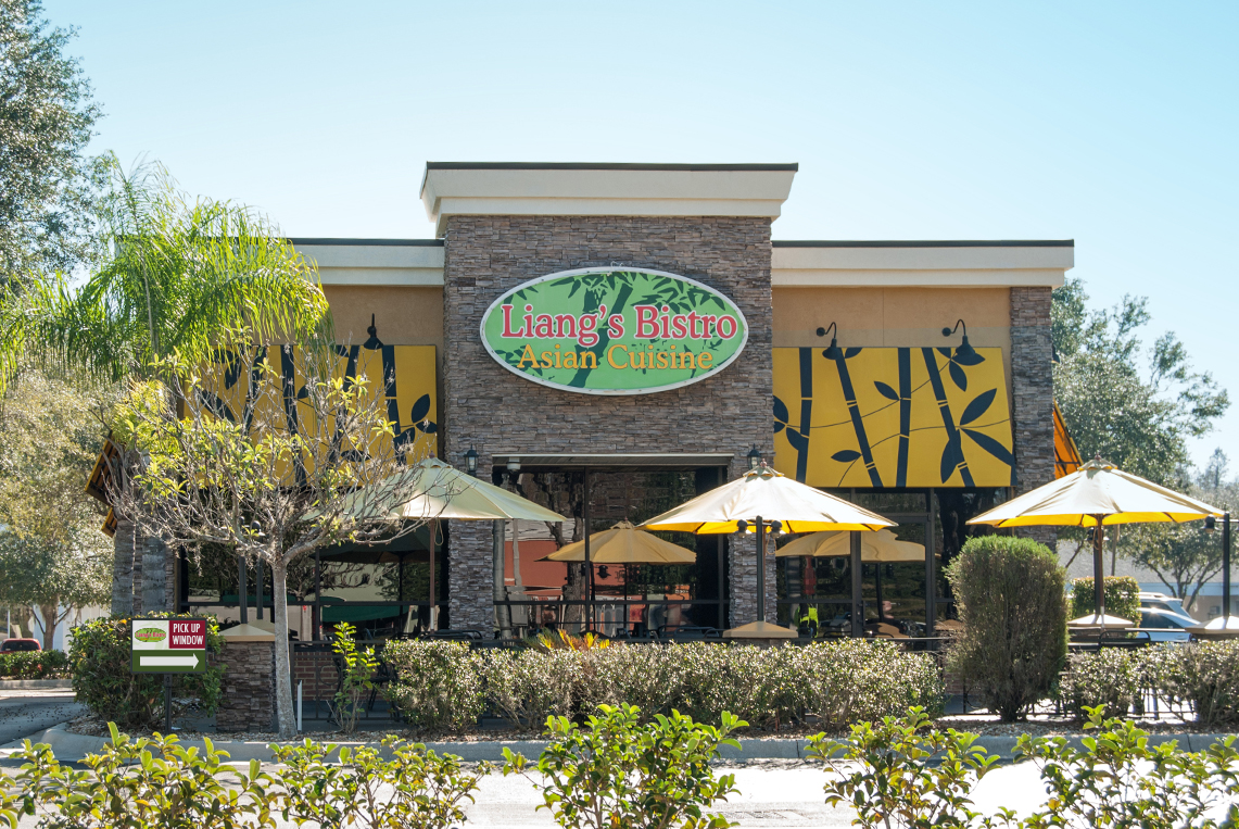
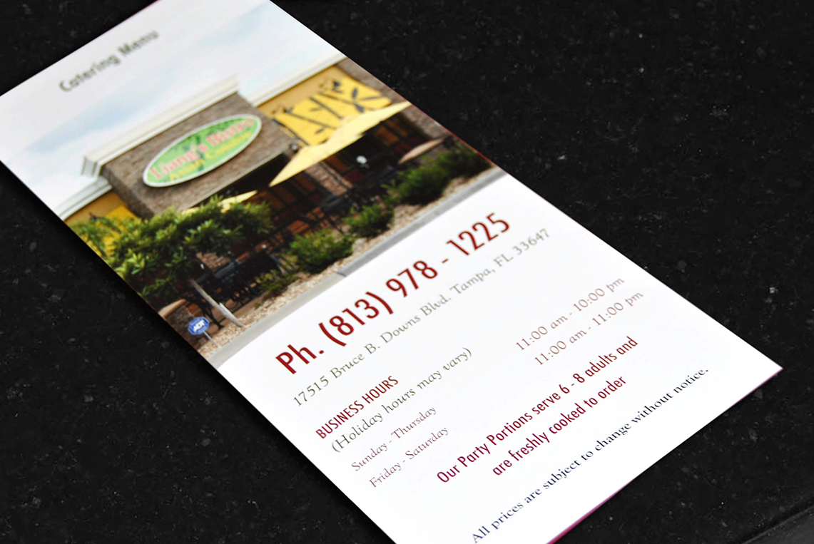
Process: The process begins with the conduction of an exploratory audit to know how the restaurant looks. On my research, I found that Liang’s Bistro is an Asian Cuisine Restaurant, who has been working on being, as they said: “more than takeout boxes and chopsticks:” Since their opening in 2004 they have been trying to create a fine dining place for their customers. The goal of this project was bring a new look and revitalization to the Liang’s Bistro Restaurant environment, in order to elevate their prestige and brand.
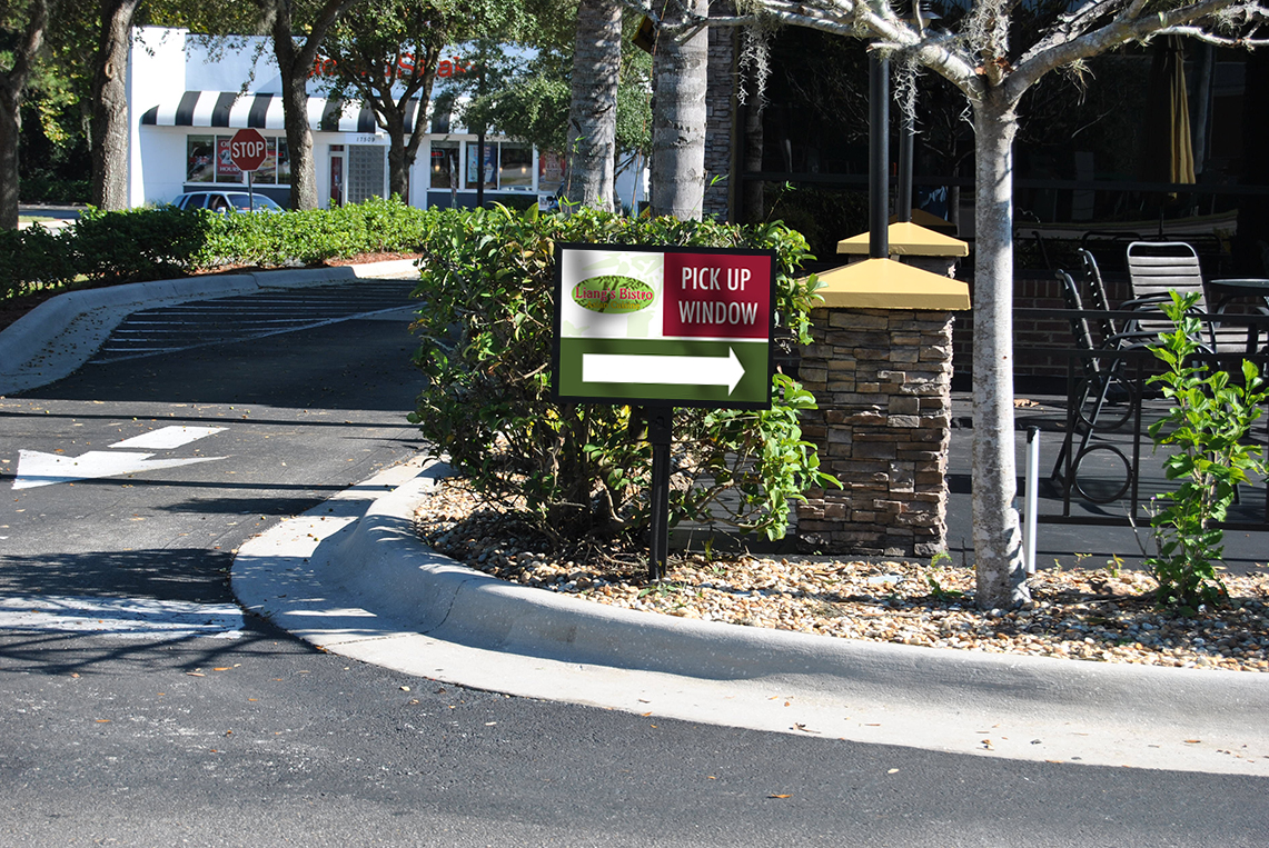
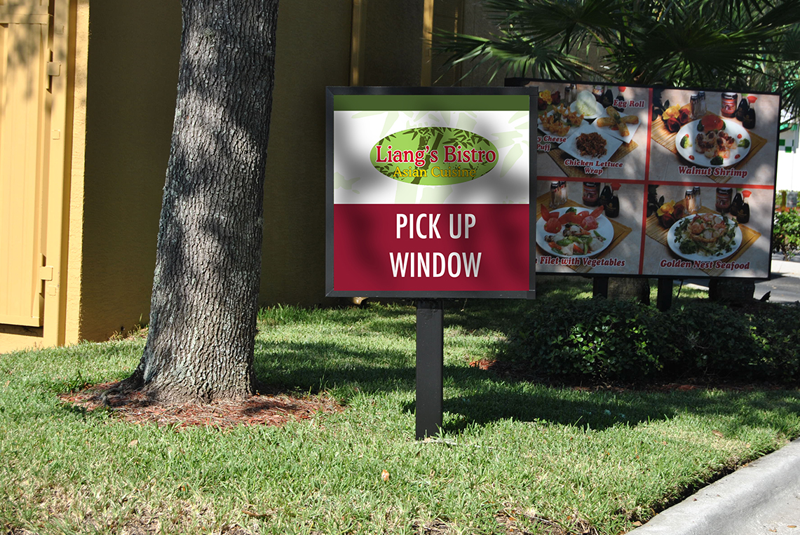
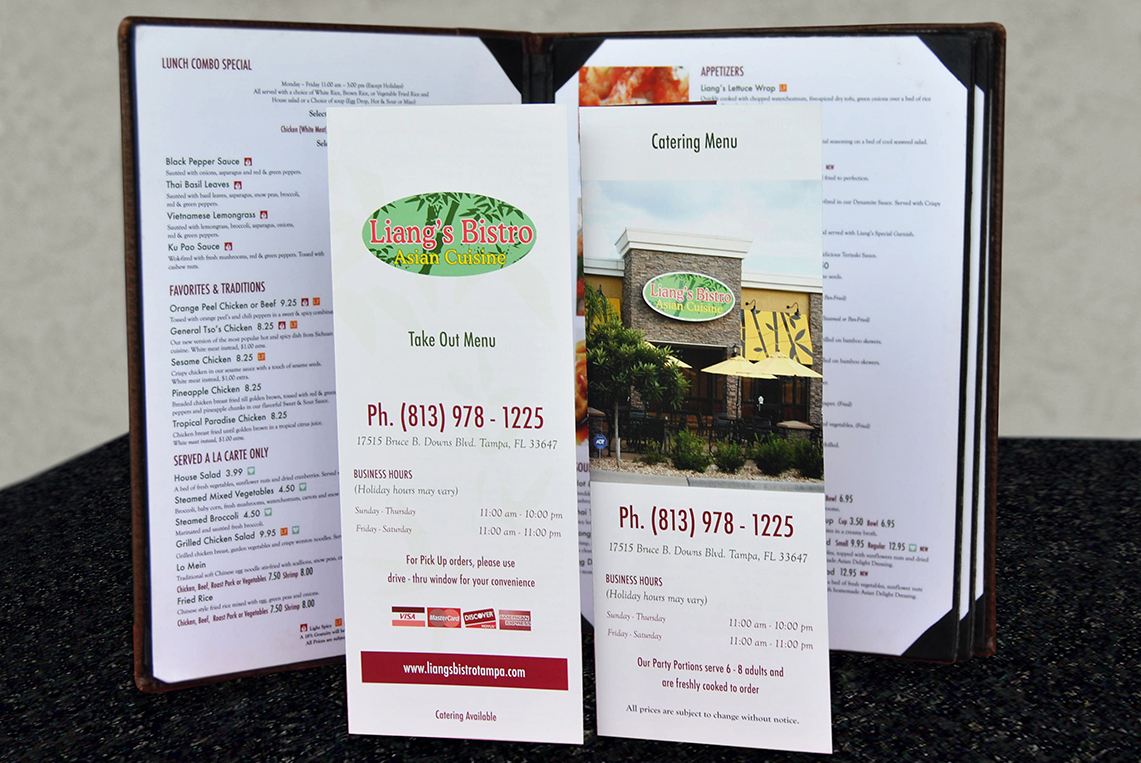
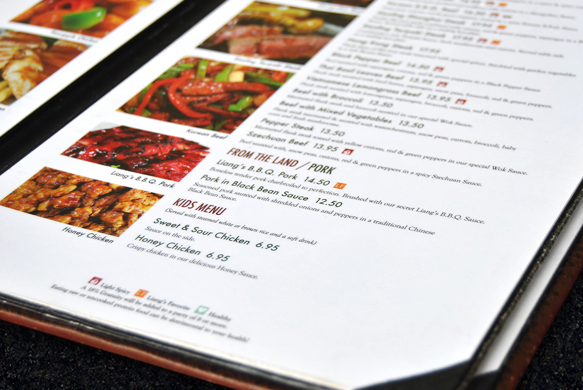
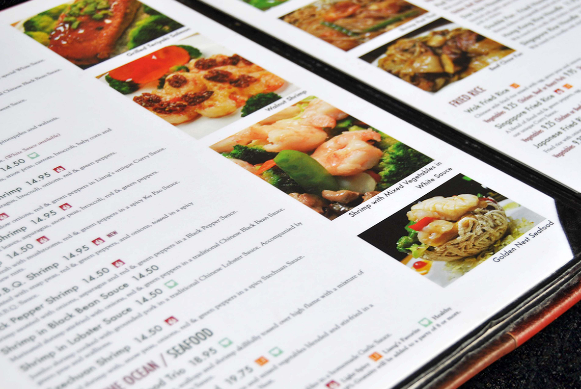
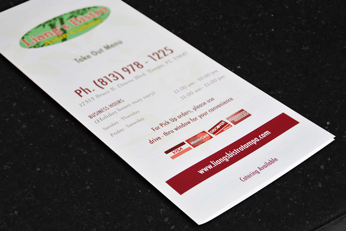
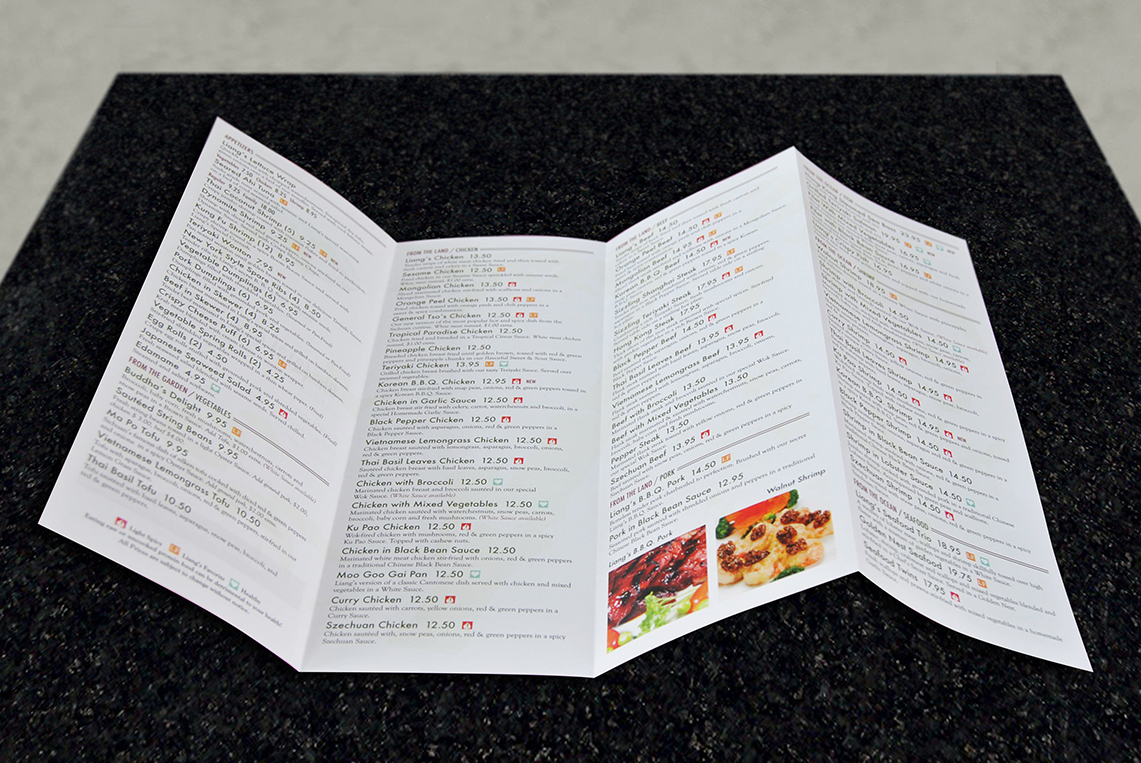
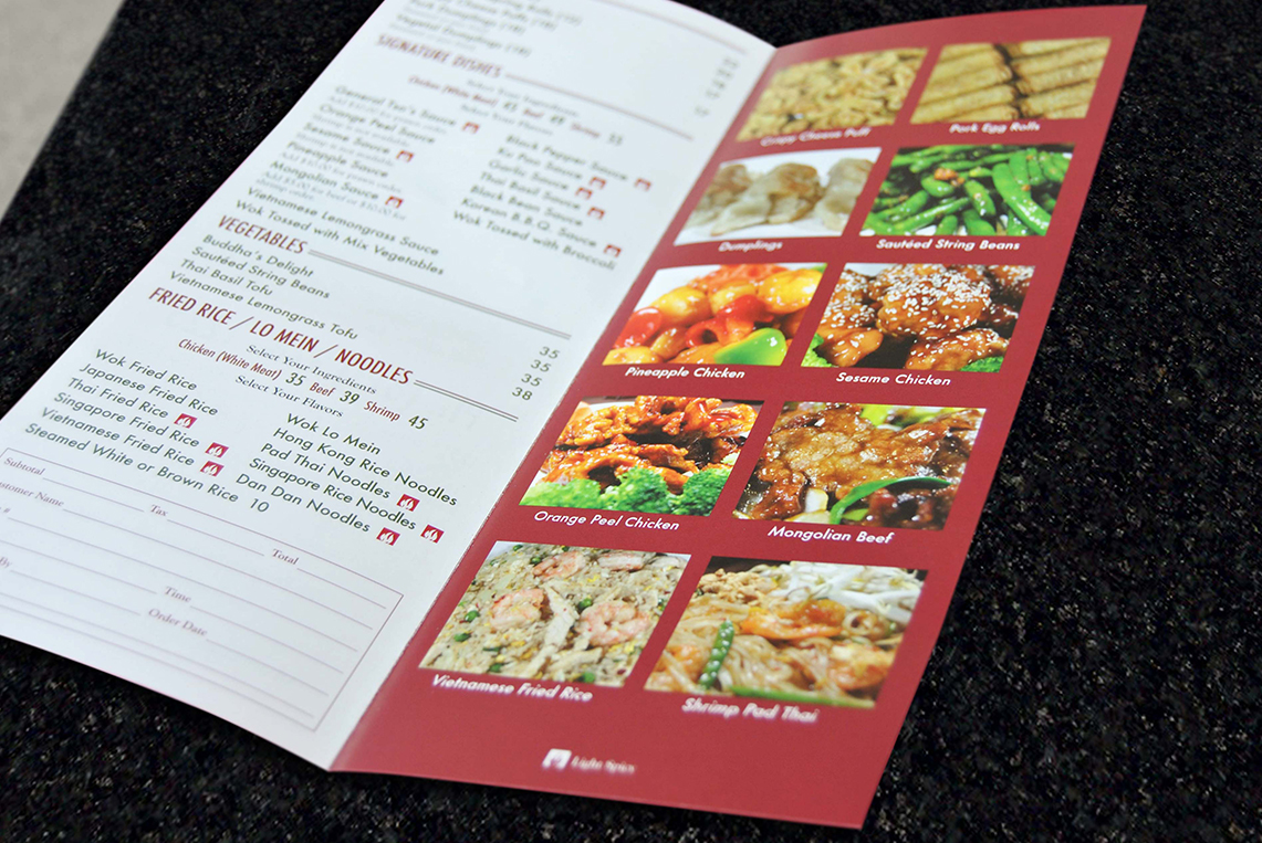
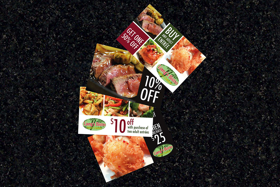
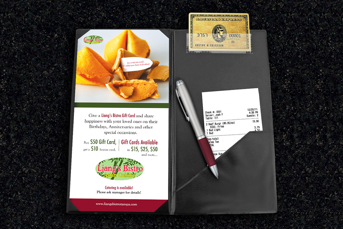
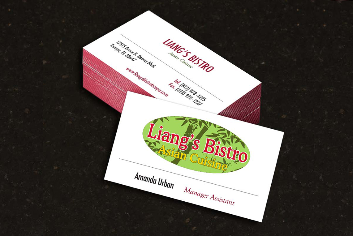
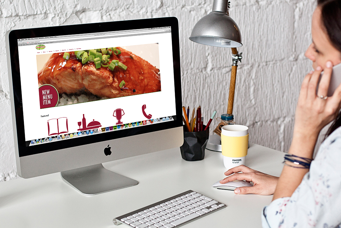
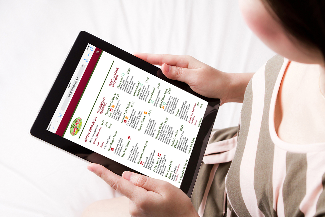
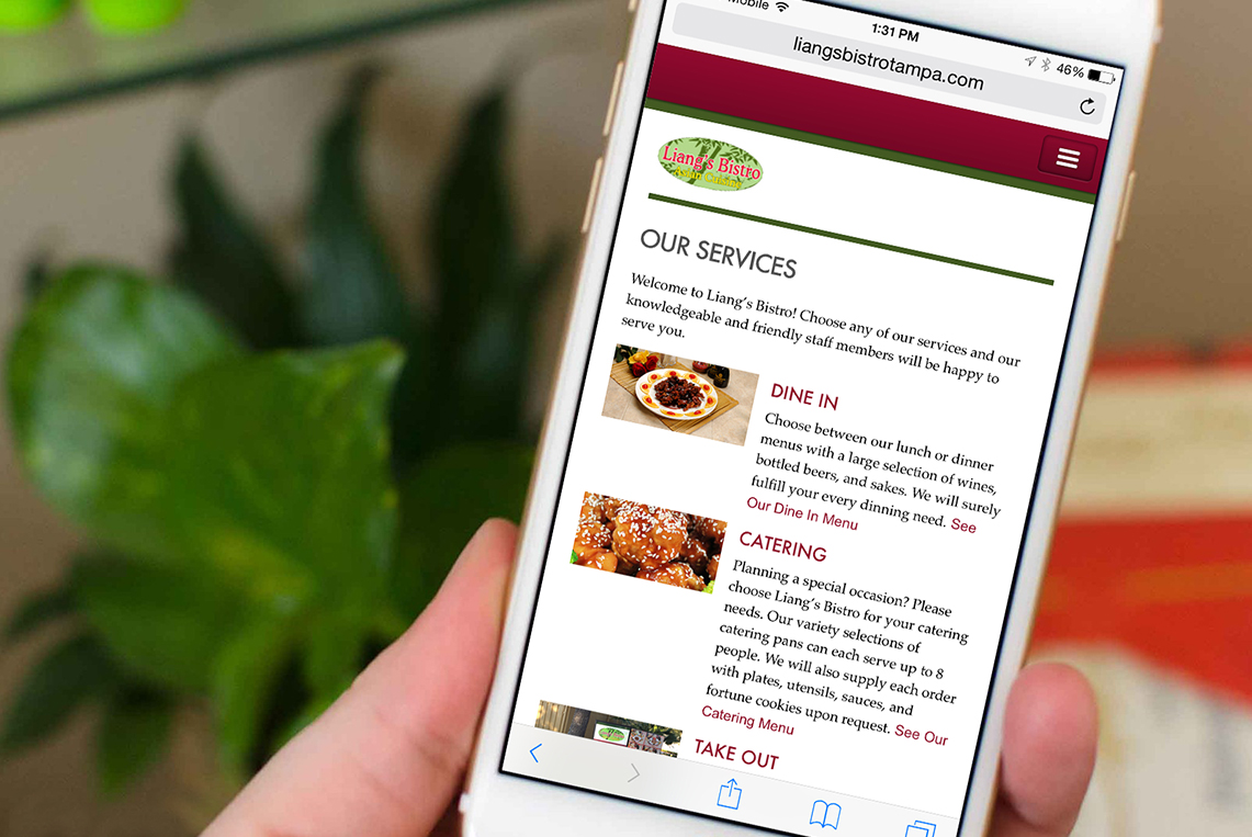
Solution: From the information collected from the audit and taken into consideration the original idea of the clients needs to bring a new look and more sophisticated environment to the restaurant I decided to base the design proposal in a minimalist concept in order to give to the restaurant the new sophisticated but modern look that the client wants. For this reason the first step to start this project was to establishe a new secondary color palette that represents the restaurant new look and appearance. The new secondary color palette was built from the colors found on the inside of the restaurant such as green and burgundy. In the same way, established new font families that represent the restaurant revitalization. The new fonts are modern and elegant, in order to give to the restaurant a more sophisticated appearance. The new color palette and fonts are going to be used in each of the printing and digital representational elements of the restaurant, in order to create a consistent brand. After determining the new brand identities for the restaurant, I started with the design of a new menu and the new identity elements of the restaurant, such as stationary system, and promotional gift cards, as well as, design and create a new website to promote the restaurant food and services. Finally, design a new signage system for their “Take Out” services, in order to offer a more useful and easy to navigate signage system for their current and future customers.
With the consistent use of the new color palette and fonts, through all the print and digital promotional pieces of the restaurant, Liang’s Bistro is not just showing a new look, they are also offering to their customers a consistent and distinctive brand.